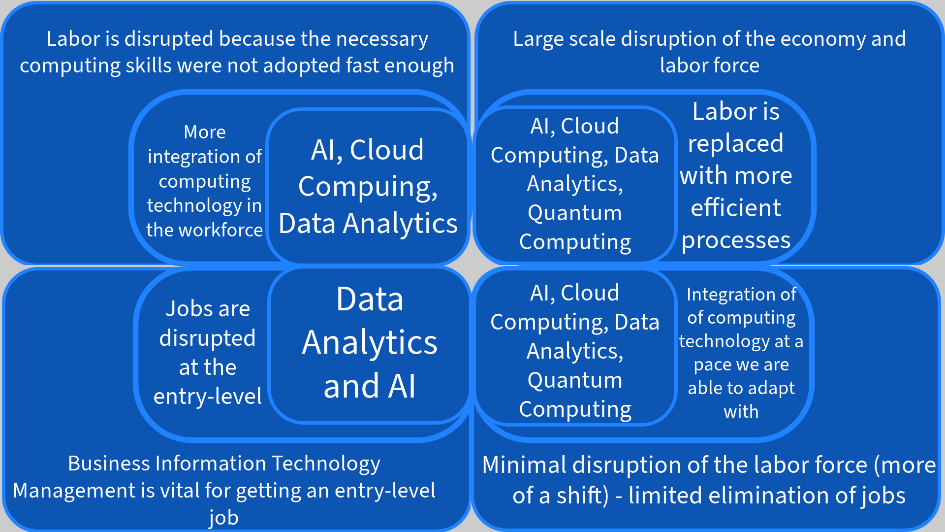
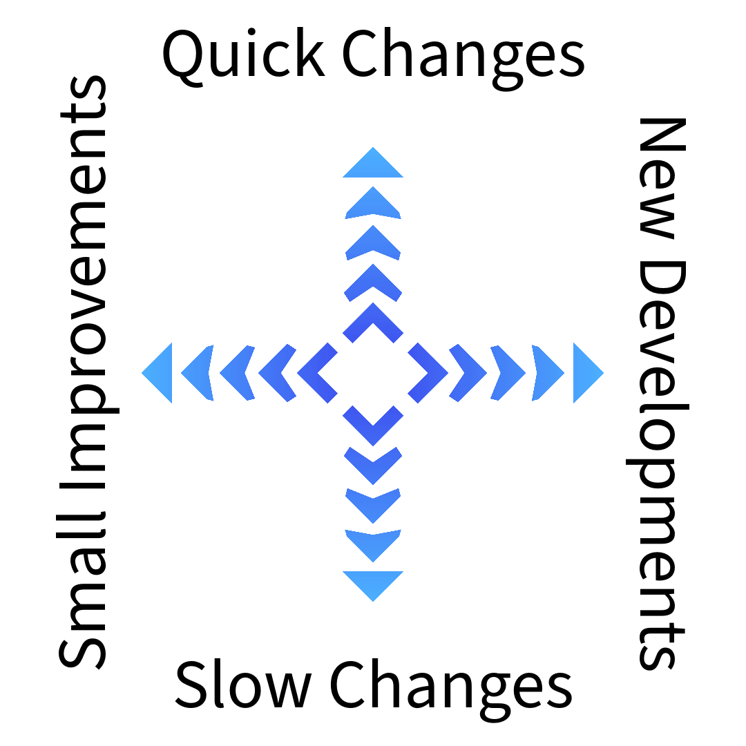
For the Axes of Uncertainty, we decided to go with a four quadrant model with three levels of information. As seen in the chart below the Axes of Uncertainty, we created another chart to show the direction and speed that changes and improvements in technology are made. For example, the upper right quadrant represents New Developments in computing implemented over a short period of time whereas the lower left quadrant represents Small Improvements made over a longer period of time. The idea behind this artifact is to show four unique outcomes and how it will impact anyone who is in the workforce. At the end of the day, no matter what improvements are made in computing and how fast they are implemented, it is important to stay ahead of the curve and learn about as much technology as possible and how it can be used.